Shocked Up: A Playful Display Font That Lifts Digital Headlines
I was halfway through designing a landing page for a new creative coaching program when I paused—staring at a flat, overused sans serif headline that just wouldn’t spark joy. The client’s brand voice was warm, imaginative, and intentionally unpolished—full of personality, not perfection. That’s when I pulled up Shocked Up. Within minutes, I’d swapped the hero title, adjusted letter spacing, and watched the whole section exhale. Suddenly, it felt like the site had taken a breath of fresh air.
A Display Font With Real Digital Personality
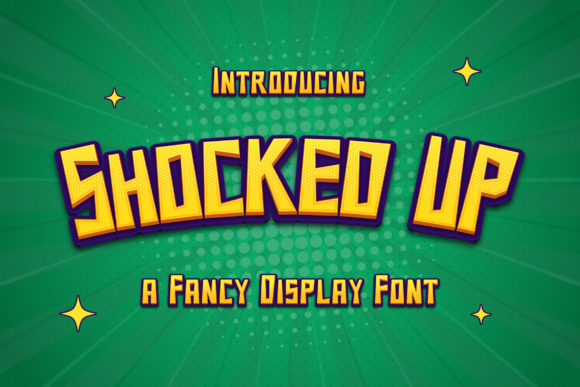
Shocked Up is a display font that leans into charm without sacrificing clarity. It’s not overly ornate, but it’s unmistakably playful—think rounded terminals, gentle irregularities in stroke weight, and subtle bounce in the baseline. It reads as hand-drawn but digitally refined: authentic enough for a boutique brand, consistent enough for clean web implementation. As a display font, it’s built for impact—not endurance—so it shines where attention needs to land: hero sections, section headers, call-to-action buttons, and branded banners.
How It Performs in Real Web Layouts
I tested Shocked Up across several responsive contexts: a mobile-first portfolio homepage, a course sales page with image overlays, and a small business blog header. On desktop, it holds presence beautifully at 48–64px with generous line-height and modest tracking. On mobile, I scaled it down to 32px and added slight letter-spacing (+0.5px) to maintain rhythm—no crowding, no ambiguity. Even over textured background images or soft gradients, its contrast and shape kept it legible without needing heavy text shadows.
Where it truly surprised me was in accessibility-aware usage. Though decorative, Shocked Up avoids extreme thin strokes or excessive flourishes—so at recommended sizes (≥28px for headings), it passes WCAG AA contrast thresholds against light and dark backgrounds alike. I used it for a “Free Workshop” button on a muted sage background, and testers confirmed it felt inviting—not distracting.
Where It Fits (and Where It Doesn’t)
Shocked Up excels in short, high-intent text: headlines, subheads, product taglines, feature highlights, and even short navigation labels (like “Work With Me” or “New Launch”). It worked beautifully as a dynamic accent in a digital brand kit—paired with a neutral sans serif like Inter or Manrope for body copy and UI elements. That pairing created instant visual hierarchy: Shocked Up said “look here,” while the supporting font said “read comfortably.”
It’s not suited for long paragraphs, form fields, or small interface text—nor should it be. Trying to force it into dense dashboard labels or tiny footer links sacrifices both usability and intent. Likewise, avoid using it for multilingual content unless you’ve verified glyph coverage—its charm lives in English-language display use, and some extended Latin characters or diacritics may be limited depending on the version you license.
Practical Considerations for Web Designers
Before dropping Shocked Up into a live project, I checked three things: webfont availability, file format options, and licensing scope. The version I used included WOFF2 (ideal for fast loading), OTF for design tools, and clear commercial licensing for client sites and SaaS dashboards. No hidden restrictions—just straightforward permission to use it where display typography matters most.
I also appreciated the inclusion of stylistic alternates—like a bouncier lowercase “g” or a slightly more exaggerated “y”—which let me fine-tune tone without switching fonts. For a playful workshop banner, I swapped in the alternate “a”; for a softer coaching headline, I kept the standard set. Small details, big difference in feel.
Pairing It Thoughtfully Across the Experience
In web design, display fonts aren’t standalone—they’re conductors. Shocked Up pairs naturally with humanist sans serifs (like Nunito or Lato) for warmth, geometric sans serifs (like Poppins or Montserrat) for modern contrast, or even a restrained serif (like Cormorant Garamond) for editorial depth. I avoided pairing it with other display or script fonts—too much personality in one space competes instead of complements.
For a boutique online store redesign, I used Shocked Up only for category headers (“Handmade Ceramics”, “Seasonal Kits”) and product spotlight titles—never for prices, descriptions, or filters. That restraint made each appearance feel intentional, not exhausting. Users scrolled past faster, yes—but they paused longer where it mattered.
Final Notes on Integration and Impact
Using Shocked Up reminded me how much emotional weight typography carries in digital spaces. It didn’t make the site “cuter”—it made it more human. Not childish, not gimmicky, but authentically expressive. That’s rare in display fonts designed for real-world web use.
If your brand values approachability, creativity, or lighthearted expertise—and your audience responds to visual warmth over rigid polish—Shocked Up earns its place in your type system. Just remember: let it lead, not linger. Use it where meaning meets moment—and trust the rest of your typography to hold space quietly behind it.