Sakelar: A Display Font That Adds Grit and Grace to Digital Layouts
Last week, I was finalizing the hero section for a new coaching website — clean layout, muted earth tones, soft photography. The client wanted warmth and authenticity, but the current sans serif headline felt too safe. Too quiet. So I opened my font library and typed “Sakelar” into the search bar.
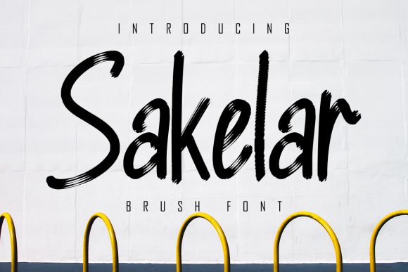
Right away, Sakelar stood out: a rough-textured, brushed display font with visible stroke variation and intentional imperfection. It’s not polished — it’s present. Like chalk on a reclaimed wood sign or ink pressed slightly unevenly onto textured paper. But unlike many decorative fonts, Sakelar doesn’t sacrifice legibility for character. Its letterforms are open, well-spaced, and confident — especially at larger sizes.
I dropped it into the hero headline: “Clarity Begins Here.” At 64px on desktop and 48px on mobile, it held up beautifully — even over a subtle image overlay. No blurring. No rendering hiccups in Chrome or Safari. The brush texture added tactile depth without competing with the content. It wasn’t shouting; it was grounding the message.
That’s where Sakelar shines: as a strategic anchor in digital layouts. It’s not built for paragraphs or navigation menus. It’s made for moments that need intention — hero titles, section headers (“Your Journey,” “What Clients Say,” “Next Steps”), CTA buttons (“Start Your Session”), and branded banners on product landing pages or course sales pages. I’ve used it on a boutique online store’s seasonal campaign banner (“Summer Edit”) and on a creative portfolio’s project category labels (“Print • Motion • Brand”). Each time, it gave visual weight without demanding attention.
Readability? Yes — with boundaries. On light backgrounds, Sakelar reads cleanly at 32px and up. Over dark or image-heavy backgrounds, I increase tracking by 20–30 units and sometimes add a subtle text shadow (1px black at 20% opacity) just to lift the texture off the background. On mobile, I avoid using it below 36px — smaller sizes lose some of its expressive charm and start feeling cramped. And while it works well in bold contexts, don’t force it into tight UI elements like small filter tags or micro-buttons. Let it breathe.
Pairing is where Sakelar reveals its versatility. I almost always pair it with a neutral, highly readable sans serif — think Inter, Manrope, or even system fonts like -apple-system — for body copy, captions, and interface text. The contrast is immediate and effective: Sakelar brings voice and texture; the sans serif delivers clarity and flow. For a more editorial or luxury-leaning brand, I’ve paired it with a warm, low-contrast serif like Cormorant Garamond — especially on blog headers or newsletter banners — where the interplay between organic brushwork and refined serifs feels intentional and human.
One thing I checked before deploying: webfont availability. Sakelar comes with WOFF2 support (great for performance), includes uppercase, lowercase, numerals, and basic punctuation, plus OpenType features like stylistic alternates. No extended Latin or Cyrillic coverage — so if your audience includes multilingual users beyond Western Europe, verify language support first. Also worth noting: it’s a commercial font, so I confirmed licensing covers web embedding, client projects, and SaaS usage before adding it to the site’s CSS stack.
In practice, I’ve seen Sakelar elevate digital brand kits — not as the only font, but as the signature typographic accent. It appears in Figma design systems as “Display / Hero,” with clear usage guidelines: never for body, never under 28px on mobile, always paired with [X] sans serif. That consistency helps teams scale the brand across landing pages, email headers, social media graphics, and even printed packaging mockups.
It’s also helped me rethink visual hierarchy. Because Sakelar has such strong personality, it naturally draws the eye — which means I can simplify surrounding elements. Less border. Less iconography. Less animation. Just space, color, and type doing the work. On a recent course sales page, swapping the default heading font for Sakelar meant I could reduce headline padding by 20% and still feel the section “landed.” That kind of efficiency matters when every scroll matters.
And yes — it works in logos. Not as a full-wordmark for complex names, but beautifully for short, evocative brand names or initials. I used it for a podcast logo (“True Tone”) where the brush texture echoed the analog warmth of vinyl and spoken word. It felt handmade but professional — not trendy, but timeless in its tactility.
What surprised me most wasn’t how well Sakelar looked — it’s a premium font, so expectations were high — but how well it behaved. No unexpected kerning gaps. No rendering inconsistencies across browsers. No weird spacing on iOS Safari. It loaded fast, rendered crisply, and scaled predictably. In an era where typography often feels like a compromise between aesthetics and performance, Sakelar feels like a rare alignment.
If you’re choosing a display font for your next digital project — whether it’s a portfolio homepage, a campaign landing page, a blog redesign, or a small business website — ask yourself: does it serve the tone *and* the interface? Does it enhance trust without sacrificing clarity? Does it feel like part of the brand, not just decoration?
Sakelar does all three — quietly, confidently, and with just the right amount of texture.